

 UI 库
UI 库
CKEditor 5 的标准 UI 库是 @ckeditor/ckeditor5-ui。它提供基础类和辅助程序,允许构建一个模块化的 UI,该 UI 可以无缝地与生态系统中的其他组件集成。
# 视图
视图使用 模板 来构建 UI。它们还提供可观察的接口,其他功能(如 插件 或 命令)可以使用这些接口来更改 DOM,而无需与本机 API 进行任何实际交互。
您可以使用创建它们的 locale 实例来本地化所有视图。查看 本地化指南 以了解如何在 locale 实例中使用 t() 函数。
# 定义
您可以定义一个简单的输入视图类,如下所示
class SimpleInputView extends View {
    constructor( locale ) {
        super( locale );

        // An entry point to binding observables with DOM attributes,
        // events, and text nodes.
        const bind = this.bindTemplate;

        // Views define their interface (state) using observable properties.
        this.set( {
            isEnabled: false,
            placeholder: ''
        } );

        this.setTemplate( {
            tag: 'input',
            attributes: {
                class: [
                    'foo',
                    // The value of "view#isEnabled" will control the presence
                    // of the class.
                    bind.if( 'isEnabled', 'ck-enabled' ),
                ],

                // The HTML "placeholder" attribute is also controlled by the observable.
                placeholder: bind.to( 'placeholder' ),
                type: 'text'
            },
            on: {
                // DOM "keydown" events will fire the "view#input" event.
                keydown: bind.to( 'input' )
            }
        } );
    }

    setValue( newValue ) {
        this.element.value = newValue;
    }
}
视图封装它们呈现的 DOM。由于 UI 按照“每个树一个视图”规则进行组织,因此很清楚哪个视图负责 UI 的哪个部分。两个功能写入同一个 DOM 节点之间发生冲突的可能性很小。
大多数情况下,视图会成为其他视图(集合)的子视图,成为 UI 视图树 中的节点。
class ParentView extends View {
    constructor( locale ) {
        super( locale );

        const childA = new SimpleInputView( locale );
        const childB = new SimpleInputView( locale );

        this.setTemplate( {
            tag: 'div',
            children: [
                childA,
                childB
            ]
        } );
    }
}

const parent = new ParentView( locale );

parent.render();

// This will insert <div><input .. /><input .. /></div>.
document.body.appendChild( parent.element );
也可以创建不属于任何集合的独立视图。它们必须在注入 DOM 之前 渲染
const view = new SimpleInputView( locale );

view.render();

// This will insert <input class="foo" type="text" placeholder="" />
document.body.appendChild( view.element );
# 交互
功能可以通过视图的可观察属性与 DOM 的状态进行交互,因此以下内容
view.isEnabled = true;
view.placeholder = 'Type some text';
将导致
<input class="foo ck-enabled" type="text" placeholder="Type some text" />
或者,它们可以 绑定 它们直接到它们自己的可观察属性
view.bind( 'placeholder', 'isEnabled' ).to( observable, 'placeholderText', 'isEnabled' );

// The following will be automatically reflected in the "view#placeholder" and
// "view.element#placeholder" HTML attribute in the DOM.
observable.placeholderText = 'Some placeholder';
此外,由于视图会传播 DOM 事件,因此功能现在可以对用户操作做出反应
// Each "keydown" event in the input will execute a command.
view.on( 'input', () => {
    editor.execute( 'myCommand' );
} );
# 最佳实践
完整的视图应该为功能提供一个接口,封装 DOM 节点和属性。功能不应该使用本机 API 触及视图的 DOM。任何类型的交互都必须由拥有 element 的视图来处理,以避免冲突
// This will change the value of the input.
view.setValue( 'A new value of the input.' );

// WRONG! This is **NOT** the right way to interact with the DOM because it
// collides with an observable binding to the "#placeholderText". The value will
// be permanently overridden when the state of the observable changes.
view.element.placeholder = 'A new placeholder';
# 模板
模板 在 UI 库中渲染 DOM 元素和文本节点。它们主要由 视图 使用,是 UI 连接应用程序和网页的最低层。
查看 TemplateDefinition 以了解有关模板语法和其他高级概念的更多信息。
模板支持 可观察属性 绑定并处理本机 DOM 事件。一个简单的模板可以像这样
new Template( {
    tag: 'p',
    attributes: {
        class: [
            'foo',
            bind.to( 'class' )
        ],
        style: {
            backgroundColor: 'yellow'
        }
    },
    on: {
        click: bind.to( 'clicked' )
    },
    children: [
        'A paragraph.'
    ]
} ).render();
它渲染到一个 HTML 元素
<p class="foo bar" style="background-color: yellow;">A paragraph.</p>
其中 observable#class 为 "bar"。上面的示例中的 observable 可以是 视图 或任何 可观察 的对象。当 class 属性的值发生变化时,模板会更新 DOM 中的 class 属性。从现在起,该元素将永久绑定到应用程序的状态。
类似地,当模板渲染时,它还会处理 DOM 事件。在定义中绑定到 click 事件会使 observable 始终在 DOM 中发生操作时触发 clicked 事件。这样,observable 提供了 DOM 元素的事件接口,所有通信都应通过它传递。
# 视图集合和 UI 树
视图被组织成 集合,这些集合管理它们的元素并进一步传播 DOM 事件。在集合中添加或删除视图会将 视图的元素 在 DOM 中移动以反映位置。
每个编辑器 UI 都有一个“根视图”(如 ClassicEditor#view),它可以在 editor.ui.view 下找到。这种视图通常定义编辑器的容器元素以及其他功能可以填充的最底层的视图集合。
例如,BoxedEditorUiView 类定义了两个集合
它还继承了 body 集合,该集合直接位于网页的 <body> 中。它存储浮动元素,如 气球面板。
插件可以使用它们的子节点填充根视图集合。这些子视图成为 UI 树的一部分,并将由编辑器管理。这意味着,例如,它们将与编辑器一起初始化和销毁。
class MyPlugin extends Plugin {
    init() {
        const editor = this.editor;
        const view = new MyPluginView();

        editor.ui.top.add( view );
    }
}
MyPluginView 可以 创建它自己的视图集合 并填充它们在编辑器生命周期中的内容。UI 树的深度没有限制,它通常看起来像这样
EditorUIView
    ├── "top" collection
    │    └── ToolbarView
    │        └── "items" collection
    │            ├── DropdownView
    │            │    ├── ButtonView
    │            │    └── PanelView
    │            ├── ButtonViewA
    │            ├── ButtonViewB
    │            └── ...
    ├── "main" collection
    │    └── InlineEditableUIView
    └── "body" collection
        ├── BalloonPanelView
        │    └── "content" collection
        │        └── ToolbarView
        ├── BalloonPanelView
        │    └── "content" collection
        │        └── ...
        └── ...
# 使用现有组件
框架提供了一些常见的 组件,如 ButtonView 或 ToolbarView。在开发新的用户界面时,它们可能会有所帮助。
例如,要创建一个带有几个按钮的工具栏,首先需要导入 ToolbarView 和 ButtonView 类
import { ButtonView, ToolbarView } from 'ckeditor5';
首先创建工具栏和几个带有标签的按钮。然后将按钮追加到工具栏
const toolbar = new ToolbarView();
const buttonFoo = new ButtonView();
const buttonBar = new ButtonView();

buttonFoo.set( {
    label: 'Foo',
    withText: true
} );

buttonBar.set( {
    label: 'Bar',
    withText: true
} );

toolbar.items.add( buttonFoo );
toolbar.items.add( buttonBar );
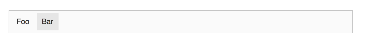
工具栏现在可以加入 UI 树,也可以直接注入 DOM。为了使示例保持简单,继续进行后者。
toolbar.render();

document.body.appendChild( toolbar.element );
结果应如下所示
工具栏渲染但没有执行任何操作。要执行单击按钮时的操作,您必须定义一个监听器。为了缩短代码,而不是两个监听器,只需定义一个,按钮可以 委托 execute 事件到它们的父级
buttonFoo.delegate( 'execute' ).to( toolbar );
buttonBar.delegate( 'execute' ).to( toolbar );

toolbar.on( 'execute', evt => {
    console.log( `The "${ evt.source.label }" button was clicked!` );
} );
# 下拉菜单
框架实现了 下拉菜单 组件,它可以在其面板中承载任何类型的 UI。它由一个 按钮(用于打开下拉菜单)和一个 面板(容器)组成。
按钮可以是以下两种之一:
- 标准
ButtonView。 - 对于更复杂的使用场景,可以使用
SplitButtonView。
下拉菜单面板公开了其 子元素 集合,该集合聚合子 视图。下拉菜单面板中显示的最常见视图是
ListView- 下拉菜单列表ToolbarView- 下拉菜单工具栏DropdownMenuRootListView- 下拉菜单
框架提供了一组辅助工具,使下拉菜单的创建过程更加轻松。仍然可以使用基础类从头开始组合自定义下拉菜单。但是,对于大多数需求,我们强烈建议使用提供的辅助函数。
The createDropdown 辅助函数创建一个带有 DropdownView 的 ButtonView 或 SplitButtonView。
import { createDropdown, SplitButtonView } from 'ckeditor5';

const dropdownView = createDropdown( locale, SplitButtonView );
这种(默认)下拉菜单带有一组行为
- 当它失去焦点时,它会关闭面板,例如,当用户将焦点移到其他地方时。
- 它在
execute事件发生时关闭面板。 - 它会聚焦面板中托管的视图,例如,当使用键盘导航工具栏时。
# 设置标签、图标和工具提示
要自定义下拉菜单的按钮,请使用 buttonView 属性。它可以直接访问下拉菜单使用的 ButtonView 实例。
如果您的下拉菜单是使用 SplitButtonView 创建的,请使用 actionView 访问其主区域。例如:dropdownView.buttonView.actionView.set( /* ... */ )。
要控制下拉菜单的标签,首先使用 withText 属性将其设置为可见。然后设置 label 的文本
const dropdownView = createDropdown( locale );

dropdownView.buttonView.set( {
    withText: true,
    label: 'Label of the button',
} );
下拉菜单按钮也可以显示图标。首先,导入 SVG 文件。然后将其传递给按钮的 icon 属性
import iconFile from 'path/to/icon.svg';

// The code that creates a dropdown view.
// ...

dropdownView.buttonView.set( {
    icon: iconFile
} );
您可以使用 编辑器中提供的图标之一。您也可以通过提供图标的完整 XML 字符串来向下拉菜单添加自定义图标,例如本示例
<svg viewBox="0 0 20 20" xmlns="http://www.w3.org/2000/svg"><path d="M10.187 17H5.773c-.637 0-1.092-.138-1.364-.415-.273-.277-.409-.718-.409-1.323V4.738c0-.617.14-1.062.419-1.332.279-.27.73-.406 1.354-.406h4.68c.69 0 1.288.041 1.793.124.506.083.96.242 1.36.478.341.197.644.447.906.75a3.262 3.262 0 0 1 .808 2.162c0 1.401-.722 2.426-2.167 3.075C15.05 10.175 16 11.315 16 13.01a3.756 3.756 0 0 1-2.296 3.504 6.1 6.1 0 0 1-1.517.377c-.571.073-1.238.11-2 .11zm-.217-6.217H7v4.087h3.069c1.977 0 2.965-.69 2.965-2.072 0-.707-.256-1.22-.768-1.537-.512-.319-1.277-.478-2.296-.478zM7 5.13v3.619h2.606c.729 0 1.292-.067 1.69-.2a1.6 1.6 0 0 0 .91-.765c.165-.267.247-.566.247-.897 0-.707-.26-1.176-.778-1.409-.519-.232-1.31-.348-2.375-.348H7z"/></svg>
如果您想要一个根据按钮状态改变颜色的图标,则应删除所有填充和描边属性。
withText 和 icon 属性是独立的,因此您的下拉菜单可以有
- 仅文本标签。
- 仅图标。
- 同时具有标签和图标。
即使您的下拉菜单没有可见标签(withText 为 false),我们也建议您仍然设置 label 属性。辅助技术(如屏幕阅读器)需要它才能与编辑器正确配合。
下拉菜单在悬停时也可以显示工具提示。使用按钮的 tooltip 属性启用此功能。您可以在工具提示中包含按键信息或创建自定义工具提示。查看该属性的文档以了解更多信息。
dropdownView.buttonView.set( {
    // The tooltip text will repeat the label.
    tooltip: true
} );
# 向下拉菜单添加列表
可以使用 addListToDropdown 辅助函数将 ListView 添加到下拉菜单。
import { ViewModel, addListToDropdown, createDropdown, Collection } from 'ckeditor5';

// The default dropdown.
const dropdownView = createDropdown( locale );

// The collection of the list items.
const items = new Collection();

items.add( {
    type: 'button',
    model: new ViewModel( {
        withText: true,
        label: 'Foo'
    } )
} );

items.add( {
    type: 'button',
    model: new ViewModel( {
        withText: true,
        label: 'Bar'
    } )
} );

// Create a dropdown with a list inside the panel.
addListToDropdown( dropdownView, items );
# 向下拉菜单添加工具栏
可以使用 addToolbarToDropdown 辅助函数将 ToolbarView 添加到下拉菜单。
import { ButtonView, SplitButtonView, addToolbarToDropdown, createDropdown } from 'ckeditor5';

const buttons = [];

// Add a simple button to the array of toolbar items.
buttons.push( new ButtonView() );

// Add another component to the array of toolbar items.
buttons.push( componentFactory.create( 'componentName' ) );

const dropdownView = createDropdown( locale, SplitButtonView );

// Create a dropdown with a toolbar inside the panel.
addToolbarToDropdown( dropdownView, buttons );
一种常见的做法是,当工具栏项之一处于启用状态时,使主下拉菜单按钮 enabled
// Enable the dropdown's button when any of the toolbar items is enabled.
dropdownView.bind( 'isEnabled' ).toMany( buttons, 'isEnabled',
    ( ...areEnabled ) => areEnabled.some( isEnabled => isEnabled )
);
# 向下拉菜单添加菜单
可以使用 addMenuToDropdown 辅助函数将多级菜单添加到下拉菜单。
import { addMenuToDropdown, createDropdown } from 'ckeditor5';

// The default dropdown.
const dropdownView = createDropdown( editor.locale );

// The menu items definitions.
const definition = [
    {
        id: 'menu_1',
        menu: 'Menu 1',
        children: [
            {
                id: 'menu_1_a',
                label: 'Item A'
            },
            {
                id: 'menu_1_b',
                label: 'Item B'
            }
        ]
    },
    {
        id: 'top_a',
        label: 'Top Item A'
    },
    {
        id: 'top_b',
        label: 'Top Item B'
    }
];

addMenuToDropdown( dropdownView, editor.body.ui.view, definition );
您很可能希望在按下某个已定义的按钮时执行某些操作
dropdownView.on( 'execute', evt => {
    const id = evt.source.id;

    console.log( id ); // E.g. will print "menu_1_a" when "Item A" is pressed.
} );
# 对话框和模态框
框架提供了 UI 对话框组件。CKEditor 5 中的对话框系统由 Dialog 插件 提供。它提供了在对话框中显示 视图 的 API。从某种意义上说,此插件对应于另一个管理 UI 中气球(弹出窗口)中视图的插件 (ContextualBalloon 插件)。
对话框是一个弹出窗口,当用户点击窗口外部时不会关闭。它允许在对话框打开时与编辑器及其内容进行交互(除非它是模态框,它会阻止与页面其余部分的交互,直到关闭)。对话框也是 可拖动的,可以使用鼠标或触摸操作,前提是您将其配置为显示 标题。一次只能打开一个对话框——打开另一个对话框会关闭之前可见的对话框。
查看这些 示例插件,它们显示了
了解有关对话框窗口的 结构和行为 的更多信息。
# 模态框
模态框类似于对话框——它们共享相同的结构规则、API 等。主要区别在于,在模态框打开时,用户无法与编辑器或页面其余部分进行交互。它们被不透明的叠加层覆盖。您可以使用模态框,例如,强制用户执行指定的操作之一。
要创建模态框,请使用 isModal 属性(可选)的 Dialog#show() 方法
editor.plugins.get( 'Dialog' ).show( {
    isModal: true,

    // The rest of the dialog definition.
} );
关闭模态框的方法有多种
下面您将了解如何禁用其中一些方法。请务必始终保留至少一个选项来关闭模态框。否则,您会将用户锁定在模态框中。
# 结构和行为
对话框可以包含三个部分,每个部分都是可选的
您无法更改这些部分的顺序。
# 标题
标题可以包含三个元素的任意组合
- 图标。
- 标题。
- “关闭”按钮。
默认情况下,只要您提供图标或标题,就会将“关闭”按钮(“X”)添加到标题中。要隐藏它,请将 hasCloseButton 标志设置为 false
import { icons } from 'ckeditor5';

// ...

editor.plugins.get( 'Dialog' ).show( {
    icon: icons.pencil,
    title: 'My first dialog',
    // Do not display the "Close" button.
    hasCloseButton: false,

    // The rest of the dialog definition.
} );
如果您决定隐藏“关闭”按钮,请务必保留其他关闭对话框的方法。Esc 键也会关闭对话框,但它可能不可用,例如,对于触摸屏用户来说。
# 内容
此部分可以是一个 视图 或一组视图。它们将直接显示在对话框的主体中。下面,您可以找到一个将文本块插入对话框的示例。
const textView = new View( locale );

textView.setTemplate( {
    tag: 'div',
    attributes: {
        style: {
            padding: 'var(--ck-spacing-large)',
            whiteSpace: 'initial',
            width: '100%',
            maxWidth: '500px'
        },
        tabindex: -1
    },
    children: [
        'This is a sample content of the dialog.',
        'You can put here text, images, inputs, buttons, etc.'
    ]
} );

editor.plugins.get( 'Dialog' ).show( {
    title: 'Info dialog with text',
    content: textView,

    // The rest of the dialog definition.
} );
对话框的内容决定了它的尺寸。如果您想显示尺寸固定的对话框,请确保内容的尺寸也是固定的。对于显示长文本,我们建议在内容容器(元素)上设置 max-height: [固定值] 和 overflow: auto。这将限制对话框在屏幕上使用的垂直空间。
# 操作按钮
对话框的最后一个部分是操作区域,按钮将显示在此区域。您可以使用 onCreate() 和 onExecute() 回调完全自定义其行为。下面您可以找到四个自定义按钮的配置示例
- 关闭对话框并设置自定义 CSS 类的“确定”按钮。
- 更改对话框标题的“设置自定义标题”按钮。
- 几秒钟后会更改其状态的“此按钮将在……中启用”按钮。
- 关闭对话框的“取消”按钮。
editor.plugins.get( 'Dialog' ).show( {
    // ...

    actionButtons: [
        {
            label: 'OK',
            class: 'ck-button-action',
            withText: true,
            onExecute: () => dialog.hide()
        },
        {
            label: 'Set custom title',
            withText: true,
            onExecute: () => {
                dialog.view.headerView.label = 'New title';
            }
        },
        {
            label: 'This button will be enabled in 5...',
            withText: true,
            onCreate: buttonView => {
                buttonView.isEnabled = false;
                let counter = 5;

                const interval = setInterval( () => {
                    buttonView.label = `This button will be enabled in ${ --counter }...`;

                    if ( counter === 0 ) {
                        clearInterval( interval );
                        buttonView.label = 'This button is now enabled!';
                        buttonView.isEnabled = true;
                    }
                }, 1000 );
            }
        },
        {
            label: 'Cancel',
            withText: true,
            onExecute: () => dialog.hide()
        }
    ]
} );
您还可以将按钮状态绑定到内容,以确保用户已执行某些必需的操作。请查看“是/否模态框”定义的示例。它要求用户选中复选框才能关闭模态框
// First, create the content to be injected into a the modal.
// In this example a simple switch button is used.
const switchButtonView = new SwitchButtonView( locale );

switchButtonView.set( {
    label: t( 'I accept the terms and conditions' ),
    withText: true
} );

// Manage the state of the switch button when the user clicks it.
switchButtonView.on( 'execute', () => {
    switchButtonView.isOn = !switchButtonView.isOn;
} );

// Then show the modal.
editor.plugins.get( 'Dialog' ).show( {
    id: 'yesNoModal',
    isModal: true,
    title: 'Accept the terms to enable the "Yes" button',
    hasCloseButton: false,
    content: switchButtonView,
    actionButtons: [
        {
            label: t( 'Yes' ),
            class: 'ck-button-action',
            withText: true,
            onExecute: () => dialog.hide(),
            onCreate: buttonView => {
                // By default, the "Yes" button in the dialog is disabled.
                buttonView.isEnabled = false;

                // The "Yes" button will be enabled as soon as the user
                // toggles the switch button.
                switchButtonView.on( 'change:isOn', () => {
                    buttonView.isEnabled = switchButtonView.isOn;
                } );
            }
        },
        {
            label: t( 'No' ),
            withText: true,
            onExecute: () => dialog.hide()
        }
    ],
    // Disable the "Esc" key.
    onShow: dialog => {
        dialog.view.on( 'close', ( evt, data ) => {
            if ( data.source === 'escKeyPress' ) {
                evt.stop();
            }
        }, { priority: 'high' } );
    }
} );
# 可访问性
对话框提供了完整的键盘可访问性。
- 在对话框打开时,按 Ctrl+F6 组合键可在编辑器和对话框之间移动焦点。
- 您也可以随时按 Esc 键关闭对话框(即使“关闭”按钮隐藏了)。
- 要浏览对话框,请使用 Tab 和 Shift+Tab 键。
对话框的内容也可以供屏幕阅读器使用。
# API
对话框的生命周期(创建和销毁)由 Dialog 插件 管理。它提供了两个公共方法:show() 和 hide()。它们都触发了相应的事件 (show 和 hide),因此可以在它们之前或之后挂钩。
# Dialog#show() 方法
The Dialog#show() 方法隐藏任何可见的对话框并显示一个新的对话框。它接受一个对话框定义,该定义允许塑造对话框的结构和行为。请参阅 DialogDefinition API 了解它提供的更多可能性。
# Dialog#show:[id] 事件
当 Dialog#show() 函数被调用时,会触发一个命名空间为 show:[id] 的事件。这允许自定义对话框的行为。
例如,您可以使用以下代码将“查找和替换”对话框的默认位置从编辑器角落更改为底部
import { DialogViewPosition } from 'ckeditor5';

// ...

editor.plugins.get( 'Dialog' ).on( 'show:findAndReplace', ( evt, data ) => {
    Object.assign( data, { position: DialogViewPosition.EDITOR_BOTTOM_CENTER } );
}, { priority: 'high' } );
您也可以监听通用 'show' 事件来一次性自定义所有对话框。
# Dialog#hide() 方法
执行 Dialog#hide() 方法将隐藏对话框。如果在相应的 Dialog#show() 方法调用中提供了该回调,它还会调用 onHide() 回调。
# Dialog#hide:[id] 事件
类似于 show:[id] 事件,hide:[id] 事件会在调用 Dialog#hide() 时触发。它允许执行自定义操作。
// Logs after the "Find and Replace" dialog gets hidden.
editor.plugins.get( 'Dialog' ).on( 'hide:findAndReplace', () => {
    console.log( 'The "Find and Replace" dialog was hidden.' );
} );
您也可以监听通用 'hide' 事件以同时对所有对话框做出反应。
# DialogView#close 事件
当对话框打开时按下 Esc 键或“关闭”按钮时,DialogView 会触发 close 事件,并带有相应的 source 参数。然后,Dialog 插件 会隐藏(并销毁)对话框。
您可以控制此行为,例如禁用 Esc 键处理。
editor.plugins.get( 'Dialog' ).view.on( 'close', ( evt, data ) => {
    if ( data.source === 'escKeyPress' ) {
        evt.stop();
    }
} )
您也可以在 onShow 回调中的 show() 方法调用中直接传递此代码。
editor.plugins.get( 'Dialog' ).show( {
    onShow: dialog => {
        dialog.view.on( 'close', ( evt, data ) => {
            if ( data.source === 'escKeyPress' ) {
                evt.stop();
            }
        }, { priority: 'high' } );
    }
    // The rest of the dialog definition.
} );
阻止使用 Esc 键会限制可访问性。这被认为是一种不好的做法。如果您需要这样做,请记住始终至少保留一种关闭对话框或模态的方式。
# 使用 onShow 和 onHide 回调
DialogDefinition 接受两个回调。它们允许在对话框显示 (onShow()) 和隐藏 (onHide()) 后自定义操作。
onShow 回调允许您操作对话框值或设置其他侦听器。在 DialogView#event:close 事件 部分,您可以找到如何使用它禁用 Esc 键的示例。下面的代码展示了如何引导动态字段填充。
// Import necessary classes.
import { View, InputTextView } from 'ckeditor5';

// Create an input.
const input = new InputTextView();
const dialogBody = new View();

dialogBody.setTemplate( {
    tag: 'div',
    children: [
        // Other elements of the view.
        input
    ]
    // The rest of the template.
} );

editor.plugins.get( 'Dialog' ).show( {
    onShow: () => {
        // Set the dynamic initial input value.
        input.value = getDataFromExternalSource();
    },
    // The rest of the dialog definition.
} );
onHide 回调在对话框关闭后重置组件或其控制器状态时尤其有用。
// Executing inside a class with the "controller" property that has the state connected to the dialog.
editor.plugins.get( 'Dialog' ).show( {
    onHide: dialog => {
        this.controller.reset(); // Reset the controller state once the dialog is hidden.
    },
    // The rest of the dialog definition.
} );
# 可见性和定位
一次只能显示一个对话框。打开另一个对话框(来自同一个或另一个编辑器实例)将关闭之前的对话框。
如果未另行指定,对话框将显示在编辑器编辑区域的中心。模态将显示在屏幕中央。自定义对话框的定位可以设置为预配置选项之一(请参见 DialogViewPosition)。对话框被用户手动拖动后,相对定位将被禁用。
- 开发对话框时,请在传递给
Dialog#show()方法的定义中指定position属性,例如
import { DialogViewPosition } from 'ckeditor5';

// ...

const dialog = editor.plugins.get( 'Dialog' );

dialog.show( {
    // ...

    // Change the default position of the dialog.
    position: DialogViewPosition.EDITOR_BOTTOM_CENTER
} );
有时,当对话框的内容或环境发生变化(例如,编辑器被调整大小)时,您可能希望强制更新对话框的位置。这将将其位置恢复为 配置的默认值。它还将重置用户进行的任何手动定位(拖动)。为此,请使用 updatePosition 方法。
editor.plugins.get( 'Dialog' ).view.updatePosition();
# 最佳实践
为了获得最佳的用户体验,编辑视图应该在任何用户操作(例如执行命令)后获得 焦点,以确保编辑器保持焦点。
// Execute some action on the "dropdown#execute" event.
dropdownView.buttonView.on( 'execute', () => {
    editor.execute( 'command', { value: "command-value" } );
    editor.editing.view.focus();
} );
# 击键和焦点管理
该框架提供内置类来帮助管理 UI 中的击键和焦点。在为应用程序提供可访问性功能时,它们很有用。
如果您想知道编辑器在幕后如何处理焦点以及哪些工具使之成为可能,请查看 深入了解焦点跟踪 指南。
# 焦点跟踪器
FocusTracker 类可以观察某些 HTML 元素并确定其中一个元素是用户(点击、键入)还是通过使用 HTMLElement.focus() DOM 方法获得焦点。
import { FocusTracker } from 'ckeditor5';

// More imports.
// ...

const focusTracker = new FocusTracker();
要注册跟踪器中的元素,请使用 add() 方法。
focusTracker.add( document.querySelector( '.some-element' ) );
focusTracker.add( viewInstance.element );
观察焦点跟踪器的 isFocused 可观察属性,使您可以确定当前注册的元素之一是否处于焦点状态。
focusTracker.on( 'change:isFocused', ( evt, name, isFocused ) => {
    if ( isFocused ) {
        console.log( 'The', focusTracker.focusedElement, 'is focused now.' );
    } else {
        console.log( 'The elements are blurred.' );
    }
} );
此信息在实现某种类型的 UI 时很有用,这种 UI 的行为取决于焦点。例如,当用户决定放弃上下文面板和包含表单的浮动气球时,它们应该隐藏。
在 深入了解焦点跟踪 指南中详细了解焦点跟踪器类。
# 击键处理程序
KeystrokeHandler 侦听由 HTML 元素或其任何后代触发的击键事件。它在按下击键时执行预定义的操作。通常,每个 视图 都会创建其击键处理程序实例。它负责处理由视图渲染的元素触发的击键。
import { KeystrokeHandler } from 'ckeditor5';

// More imports.
// ...

const keystrokeHandler = new KeystrokeHandler();
要定义 DOM 中击键处理程序的范围,请使用 listenTo() 方法。
keystrokeHandler.listenTo( document.querySelector( '.some-element' ) );
keystrokeHandler.listenTo( viewInstance.element );
查看击键处理程序支持的 已知键名 列表。
击键操作回调是函数。要阻止击键的默认操作并停止进一步传播,请使用回调中提供的 cancel() 函数。
keystrokeHandler.set( 'Tab', ( keyEvtData, cancel ) => {
    console.log( 'Tab was pressed!' );

    // This keystroke has been handled and can be canceled.
    cancel();
} );
还有一个 EditingKeystrokeHandler 类,它与 KeystrokeHandler 具有相同的 API,但它为编辑器命令提供直接击键绑定。
编辑器在 editor.keystrokes 属性下提供此类击键处理程序,因此任何插件都可以注册与编辑器命令相关的击键。例如,Undo 插件注册 editor.keystrokes.set( 'Ctrl+Z', 'undo' ); 以执行其 undo 命令。
当您将多个回调分配给同一个击键时,可以使用优先级来决定哪个回调首先处理以及是否完全执行其他回调。
keystrokeHandler.set( 'Ctrl+A', ( keyEvtData ) => {
    console.log( 'A normal priority listener.' );
} );

keystrokeHandler.set( 'Ctrl+A', ( keyEvtData ) => {
    console.log( 'A high priority listener.' );

    // The normal priority listener will not be executed.
    cancel();
}, { priority: 'high' } );
按下 Ctrl+A 将记录
"A high priority listener."
查看 事件系统深入了解指南,详细了解事件侦听器优先级。
我们每天都在努力使我们的文档保持完整。您是否发现过时信息?是否缺少某些内容?请通过我们的 问题跟踪器 报告。
随着 42.0.0 版本的发布,我们重新编写了许多文档以反映新的导入路径和功能。感谢您的反馈,帮助我们确保文档的准确性和完整性。